
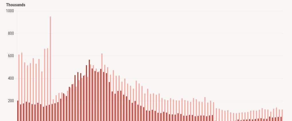
Recently, the foreclosure data showed a 21% year-over-year gain, and the floodgates of doom porn were flung wide open, with people marketing an impending home-price crash because they say so many Americans are struggling and it’s about to get worse. The hucksters of America are back at it again, and it went mainstream, too.
Andrew Yang, the former presidential candidate for the Democratic party, posted today on X: “The pain is spreading to homeowners. Highest foreclosure rate in 7 years and it gets worse from here.”
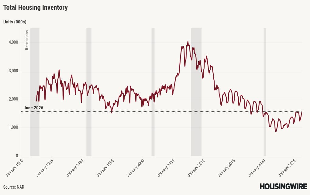
He reposted an article from a traditional doom porn specialist on X, something we seem have a lot of. Over the last few days, people have been sending me videos of an impending foreclosure crisis that would be worse than 2008 because apparently we also have the largest number of sellers versus buyers ever in the history of the U.S. That is also a lie, by the way. In 2007, we had 4 million active listings; today we are at 1.56 million. Normal levels are between 2 million and 2.5 million.
This article will show you how to combat this narrative.
There’s no foreclosure crisis, folks
The best reference for this topic is the New York Federal Reserve and the chart below from the quarterly Household Debt and Credit Report. This is the chart I show in live events where I speak about the housing bubble crisis and how foreclosure were rising in 2005, 2006, 2007 and 2008 — then the job loss recession happened. Just look at the bankruptcy data in the early part of the century. The highest credit risk cycle in over 100 years took four years to build up; it needed a massive credit boom cycle to build up before it.
None of that is happening today. If you believe we have a foreclosure crisis today, then we have been in a foreclosure crisis since WWII. Traditionally, there are always 1%-4% of mortgage loans in some stage of delinquency. Foreclosures happen every year — we are just getting back to normal levels.
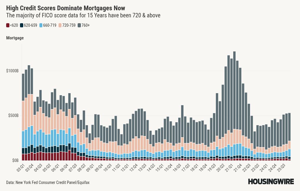
Just remember: stock versus flow. We have over 162 million people working and we passed two important laws that affect foreclosures: the Bankruptcy Reform Law in 2005 and Dodd-Frank, which created the Qualified Mortgage rule, in 2014. Because of these laws, the credit profiles of homeowners look great in scale terms.
Foreclosure to supply takes time
A really important data line in this discussion is our weekly new listings data, which is why we include it in the Housing Market Tracker every week. If the housing market is having a credit bust, then our new listings would take off. However, the last five years have been the lowest new listings data in history; it didn’t matter if rates were at 3% or 8%. Even in 2026, new listings data has never gotten back to normal, which would be 80,000-100,000 during the seasonal peak months.
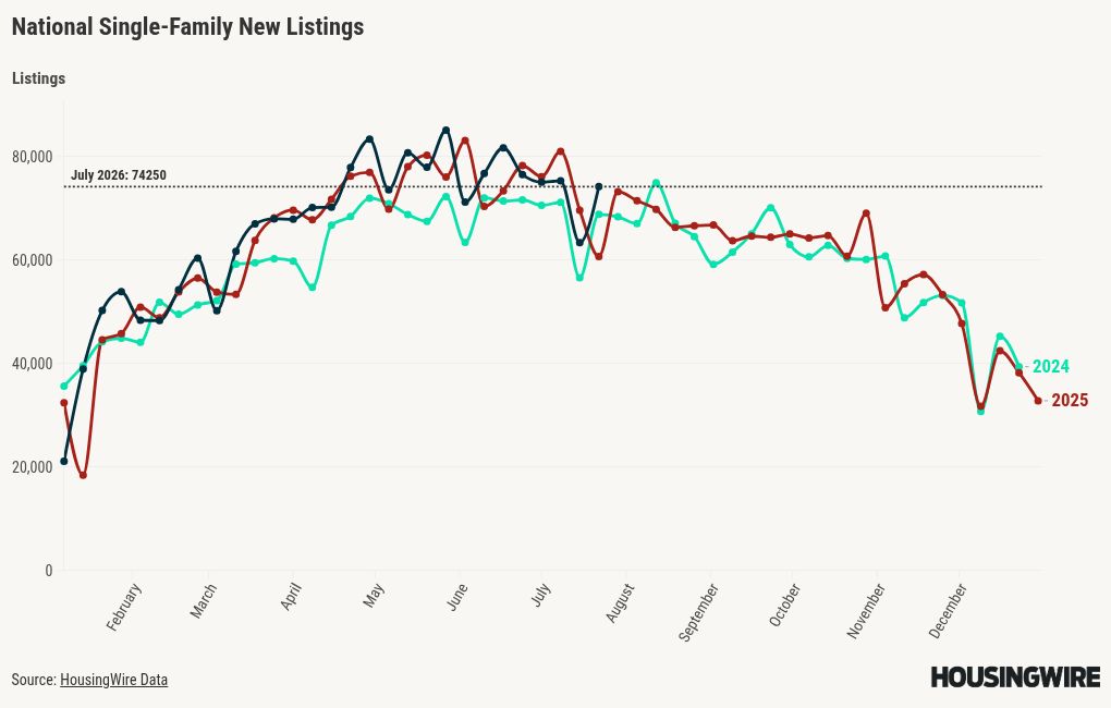
During the housing bubble credit crisis, new listings were running from 250,000-400,000 per week for years. Years, people! Compare that to today:
New listings:
- 2026, last week: 74,250
- In 2009: 286,855
- In 2010: 379,711
- In 2011, it was 392,396
Homeowners have a lot of nested equity this time around
I am keeping this simple: in 2010, more than 23% of the homes were underwater. Take a look at the new listings data above; we had many distressed sellers run into a market that, for the first time, had prices crash 17% in 2007 and 2008, while the great financial recession was going on. That was a lot of drama back then!
But now, 40% of homes don’t even have a mortgage, the down payment percentage data has been the highest in the 21st century over the last few years, and homeowners’ net equity is massive this time around.
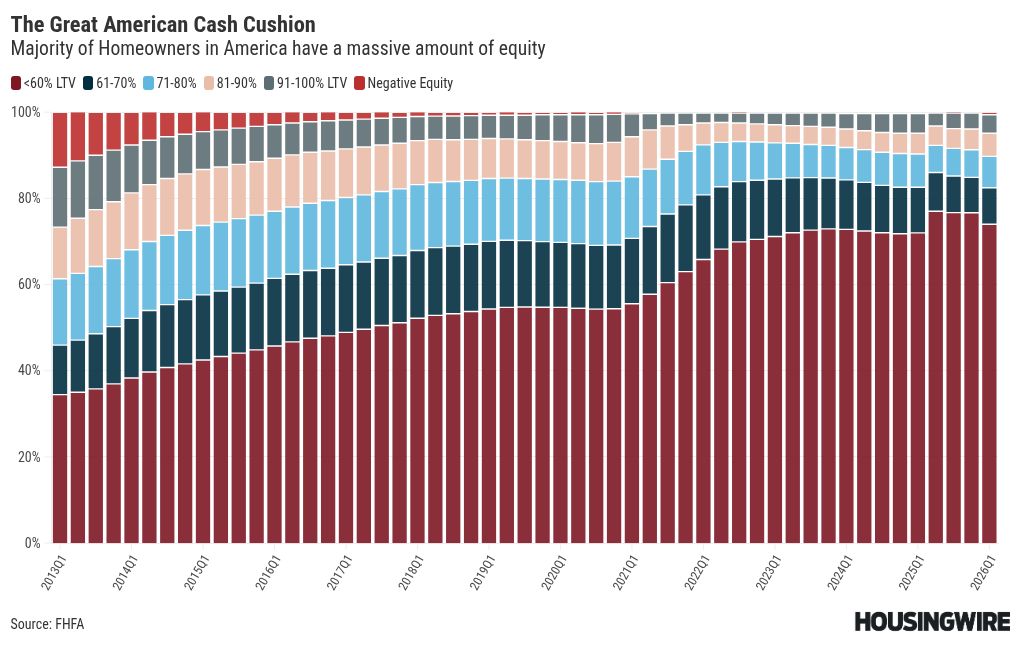
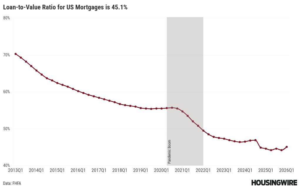
The total LTV data back in 2008 was running around 85%; today it’s 45.1%. I mean, come on folks, it’s a much different market.
Remember this: We had a lot of toxic loans in the system with the run-up in credit from 2002-2025; now the majority of Americans have-30-year fixed rates and most of them have rates under 6%, as you can see in the data below.
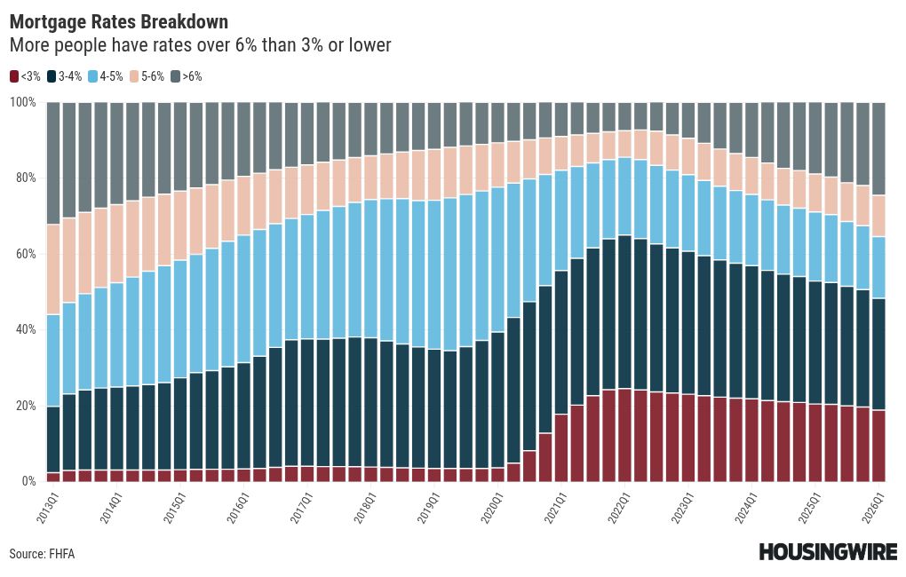
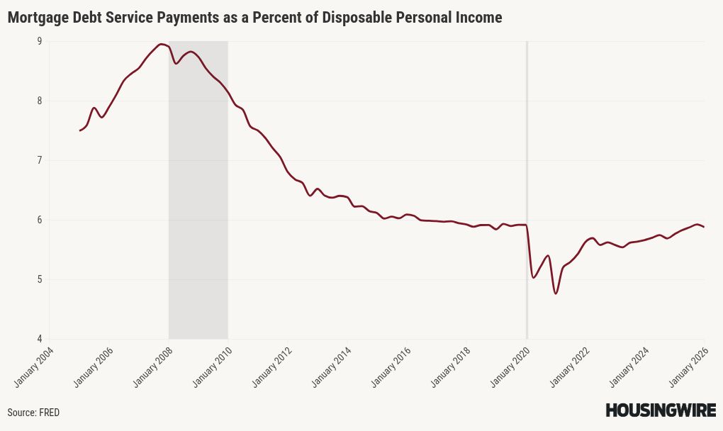
When you have a 30-year fixed loan, your wages rise every year, but your debt cost stays the same, leaving more money for other things. Unlike the housing bubble crash years, when rate recasts caused higher mortgage payments, which led to mortgage stress, we don’t have that type of payment shock in our system anymore.
Conclusion
All the data above should put talk of a fake foreclosure crisis to rest, and remember: foreclosure is a process. The process starts with a 30-day, 60-day, 90-day, or 120-day late notice, then a notice of default, and it takes time for that supply to hit the market. The housing bubble years were the first real foreclosure crisis post-WWII, as we have had many job-loss recessions before but no foreclosure crisis. That was the only time in over 80 years that national nominal home prices crashed.
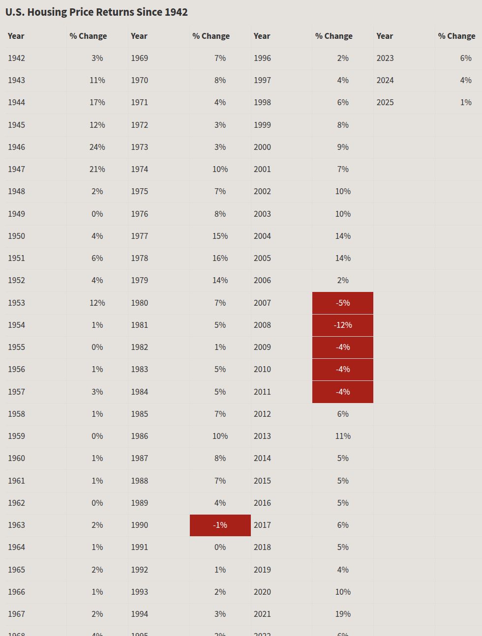
So now you all have the data to show people what is really going on, what it takes to get a real foreclosure crisis and where to look in the data for any signals that is happening.